Kids Brand

Moving the Free Shipping Bar Below the CTA Increased Conversions by 7.41% (And Why Moving It Up Hurt Sales)

The Problem

Competing for Attention at the Critical Moment

Every element on a page competes for user attention. When multiple elements vie for focus simultaneously, users experience cognitive overloadโ€”they don't know where to look or what action to take first.

This is especially critical at high-intent moments like the cart drawer, where users have already signaled purchase intent. The question becomes: How do you present incentive information (like free shipping progress) without distracting users from the primary action (checkout)?

The universal principle: Placement determines priority. What appears first gets attention first. What appears last serves as a final reminder. Understanding this hierarchy is the difference between nudging users toward conversion and accidentally distracting them from it.

โ€

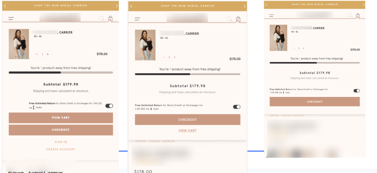
The Challenge:The cart drawer contained a free shipping progress bar ("You're 1 product away from free shipping!") positioned between the product information and the checkout CTAs. This placement created a visual hierarchy conflict:

  • Product info โ†’ Free shipping bar โ†’ Checkout CTAs

The free shipping bar, while valuable information, was competing for attention with the primary action buttons. Users' eyes were drawn to the progress bar instead of the checkout button.

The Behavioral Issue:

  • Attention split: Users processed the shipping incentive instead of focusing on checkout
  • Decision delay: The progress bar introduced a "should I add more?" moment before the checkout decision
  • Visual clutter: Too many elements between the product and the action button
  • Friction point: The moment of highest purchase intent became a moment of consideration

The Core Question: Should the free shipping bar appear before the checkout CTAs (as an incentive to add more) or after them (as a final reminder without distraction)?

โ€

๐Ÿงช The Hypothesis

"If we reposition the free shipping bar to reduce visual competition with the checkout CTAs, we can increase the prominence of the primary action and improve conversion rates."

Psychological Principles:

  1. Visual Hierarchy: Elements positioned closer to CTAs compete for attention
  2. F-Pattern Reading: Users scan from top to bottom; what's at the bottom is seen last
  3. Action Primacy: The primary action should have the clearest visual path
  4. Recency Effect: Information seen last (at the bottom) serves as a final reminder without interfering with the decision

โ€

The Experiment

We tested two variations of the free shipping bar placement in the cart drawer:

Control:

  • Free shipping bar positioned between product info and checkout CTAs
  • Visual flow: Product โ†’ Shipping Bar โ†’ Checkout Buttons
  • The bar competed for attention with the primary action

Variation 1: Move to Top (Stopped Early)

  • Free shipping bar moved to the top of the cart drawer (above product info)
  • Visual flow: Shipping Bar โ†’ Product โ†’ Checkout Buttons
  • Result: Performed worse than control, stopped early

Variation 2: Move Below CTA (Winner) ๐Ÿ†

  • Free shipping bar moved below the "View Cart" CTA (at the bottom)
  • Visual flow: Product โ†’ Checkout Buttons โ†’ Shipping Bar
  • The bar serves as a final reminder without competing with checkout

Trigger: Experiment triggered when users added a product to cart (not on pageview)

โ€

๐Ÿ“ˆ The Results

Winner: Variation 2 (Shipping Bar Below CTA)

Overall Performance

Variation 1 (Move to Top):

  • -5.64% Conversion Rate
  • -0.41% Revenue per Visitor
  • Stopped early due to poor performance

Variation 2 (Shipping Bar Below CTA)

  • +7.41% Conversion Rate
  • +5.93% Revenue per Visitor

โ€

Mobile vs. Desktop:

Mobile Users:

  • +6.73% Conversion Rate
  • +6.21% Revenue per Visitor
  • +7.57% Click Checkout Cart Drawer

Desktop Users:

  • +8.19% Conversion Rate
  • +0.11% Revenue per Visitor ๏ธ
  • +12.96% Click Checkout Cart Drawer

โ€

New vs. Returning Users (Mobile):

New Mobile Users:

  • +4.22% Conversion Rate
  • +5.24% Revenue per Visitor

Returning Mobile Users:

  • +16.15% Conversion Rate
  • +11.89% Revenue per Visitor

Statistical Confidence: 94% probability of outperforming control

โ€

๐Ÿ’ก The Critical Insight: Why Placement Matters So Much

Why Variation 1 Failed (Move to Top):

Moving the shipping bar to the top made it the first thing users saw. This created immediate distraction:

  • Users focused on "How much more do I need to add?" instead of "Should I checkout?"
  • The incentive became a decision point rather than a reminder
  • It shifted the user's mindset from "I'm ready to buy" to "Should I buy more?"

โ€

Why Variation 2 Won (Move Below CTA):

Moving the shipping bar to the bottom created a clean visual path to checkout:

  • Users see: Product โ†’ Checkout Button (clear action)
  • After the CTAs, they see the shipping bar as a final reminder
  • If they're ready to checkout, they click without distraction
  • If they're not ready, the shipping bar nudges them to add more

The Psychology:

  • Top placement = "Consider this before you act" (creates hesitation)
  • Bottom placement = "Remember this after you decide" (reinforces without interfering)

โ€

๐ŸŽฏ What This Means for Your Store

1. Don't Compete with Your Own CTA: Every element between the user and the checkout button is potential friction. If an incentive (like free shipping) is positioned before the CTA, it competes for attention and can delay the action.

2. Placement Determines Priority: What appears first gets processed first. What appears last serves as a reminder. Use this hierarchy intentionally:

  • Top: Brand messaging, product info
  • Middle: Primary action (checkout)
  • Bottom: Secondary incentives, reminders

3. Incentives Can Be Distractions: Free shipping bars, upsell offers, and promotional messages are valuableโ€”but only if they don't interfere with the primary conversion path. Sometimes the best placement is after the main action.

4. Returning Users Respond Strongly: The +16.15% conversion lift for returning mobile users shows that familiar customers appreciate clear, distraction-free checkout flows. They know what they wantโ€”don't make them think.

5. Test Both Directions: We tested moving the bar up (V1) and down (V2). V1 failed, V2 won big. Without testing both, we might have implemented a losing change or missed the winning pattern.

6. 94% Confidence is Strong: This is a reliable, repeatable pattern. The magnitude of the lift (+7.41% conversion) combined with high confidence makes this a clear implementation decision.

โ€

๐ŸŽฏ Key Takeaways

Don't place incentives between product and CTA โ€” They compete for attention

Bottom placement = final reminder โ€” Reinforces without interfering

โ€Top placement = decision point โ€” Creates hesitation and delays action

โ€Returning users need clear paths โ€” They respond strongly to reduced friction

โ€Test both directions โ€” Up and down can have opposite effects

โ€94% confidence + strong lift = implement โ€” This is a reliable pattern

โ€

The Lesson: Incentives are powerful, but timing matters. An incentive that appears before the action creates hesitation. An incentive that appears after the action reinforces the decision without interfering.
The Results

The Results

7.41%

increase in Purchase Conversion Rate

5.93%

increase in Revenue Per Visitor

7.70%

increase in Click Checkout CTA

Get started workingย with SplitConvert

Contact us

Lorem ipsum dolor sit amet, consectetur

Lorem ipsum dolor sit amet, consectetur adipiscing elit. Suspendisse varius enim in eros elementum tristique.

Lorem ipsum dolor sit amet

Lorem ipsum dolor sit amet, consectetur adipiscing elit. Suspendisse varius enim in eros elementum tristique. Duis cursus, mi quis viverra ornare.

Lorem ipsum dolor sit amet

Lorem ipsum dolor sit amet, consectetur adipiscing elit. Suspendisse varius enim in eros elementum tristique. Duis cursus, mi quis viverra ornare.

Lorem ipsum dolor sit amet

Lorem ipsum dolor sit amet, consectetur adipiscing elit. Suspendisse varius enim in eros elementum tristique. Duis cursus, mi quis viverra ornare.

Thanks for your interest in working with us. You'll hear from us the next 24-48hrs unless you sent this on a Friday or weekend, in which case Monday it is.
Oops! Something went wrong while submitting the form.
Kids Brand

Moving the Free Shipping Bar Below the CTA Increased Conversions by 7.41% (And Why Moving It Up Hurt Sales)

The Problem

Competing for Attention at the Critical Moment

Every element on a page competes for user attention. When multiple elements vie for focus simultaneously, users experience cognitive overloadโ€”they don't know where to look or what action to take first.

This is especially critical at high-intent moments like the cart drawer, where users have already signaled purchase intent. The question becomes: How do you present incentive information (like free shipping progress) without distracting users from the primary action (checkout)?

The universal principle: Placement determines priority. What appears first gets attention first. What appears last serves as a final reminder. Understanding this hierarchy is the difference between nudging users toward conversion and accidentally distracting them from it.

โ€

The Challenge:The cart drawer contained a free shipping progress bar ("You're 1 product away from free shipping!") positioned between the product information and the checkout CTAs. This placement created a visual hierarchy conflict:

  • Product info โ†’ Free shipping bar โ†’ Checkout CTAs

The free shipping bar, while valuable information, was competing for attention with the primary action buttons. Users' eyes were drawn to the progress bar instead of the checkout button.

The Behavioral Issue:

  • Attention split: Users processed the shipping incentive instead of focusing on checkout
  • Decision delay: The progress bar introduced a "should I add more?" moment before the checkout decision
  • Visual clutter: Too many elements between the product and the action button
  • Friction point: The moment of highest purchase intent became a moment of consideration

The Core Question: Should the free shipping bar appear before the checkout CTAs (as an incentive to add more) or after them (as a final reminder without distraction)?

โ€

๐Ÿงช The Hypothesis

"If we reposition the free shipping bar to reduce visual competition with the checkout CTAs, we can increase the prominence of the primary action and improve conversion rates."

Psychological Principles:

  1. Visual Hierarchy: Elements positioned closer to CTAs compete for attention
  2. F-Pattern Reading: Users scan from top to bottom; what's at the bottom is seen last
  3. Action Primacy: The primary action should have the clearest visual path
  4. Recency Effect: Information seen last (at the bottom) serves as a final reminder without interfering with the decision

โ€

The Experiment

We tested two variations of the free shipping bar placement in the cart drawer:

Control:

  • Free shipping bar positioned between product info and checkout CTAs
  • Visual flow: Product โ†’ Shipping Bar โ†’ Checkout Buttons
  • The bar competed for attention with the primary action

Variation 1: Move to Top (Stopped Early)

  • Free shipping bar moved to the top of the cart drawer (above product info)
  • Visual flow: Shipping Bar โ†’ Product โ†’ Checkout Buttons
  • Result: Performed worse than control, stopped early

Variation 2: Move Below CTA (Winner) ๐Ÿ†

  • Free shipping bar moved below the "View Cart" CTA (at the bottom)
  • Visual flow: Product โ†’ Checkout Buttons โ†’ Shipping Bar
  • The bar serves as a final reminder without competing with checkout

Trigger: Experiment triggered when users added a product to cart (not on pageview)

โ€

๐Ÿ“ˆ The Results

Winner: Variation 2 (Shipping Bar Below CTA)

Overall Performance

Variation 1 (Move to Top):

  • -5.64% Conversion Rate
  • -0.41% Revenue per Visitor
  • Stopped early due to poor performance

Variation 2 (Shipping Bar Below CTA)

  • +7.41% Conversion Rate
  • +5.93% Revenue per Visitor

โ€

Mobile vs. Desktop:

Mobile Users:

  • +6.73% Conversion Rate
  • +6.21% Revenue per Visitor
  • +7.57% Click Checkout Cart Drawer

Desktop Users:

  • +8.19% Conversion Rate
  • +0.11% Revenue per Visitor ๏ธ
  • +12.96% Click Checkout Cart Drawer

โ€

New vs. Returning Users (Mobile):

New Mobile Users:

  • +4.22% Conversion Rate
  • +5.24% Revenue per Visitor

Returning Mobile Users:

  • +16.15% Conversion Rate
  • +11.89% Revenue per Visitor

Statistical Confidence: 94% probability of outperforming control

โ€

๐Ÿ’ก The Critical Insight: Why Placement Matters So Much

Why Variation 1 Failed (Move to Top):

Moving the shipping bar to the top made it the first thing users saw. This created immediate distraction:

  • Users focused on "How much more do I need to add?" instead of "Should I checkout?"
  • The incentive became a decision point rather than a reminder
  • It shifted the user's mindset from "I'm ready to buy" to "Should I buy more?"

โ€

Why Variation 2 Won (Move Below CTA):

Moving the shipping bar to the bottom created a clean visual path to checkout:

  • Users see: Product โ†’ Checkout Button (clear action)
  • After the CTAs, they see the shipping bar as a final reminder
  • If they're ready to checkout, they click without distraction
  • If they're not ready, the shipping bar nudges them to add more

The Psychology:

  • Top placement = "Consider this before you act" (creates hesitation)
  • Bottom placement = "Remember this after you decide" (reinforces without interfering)

โ€

๐ŸŽฏ What This Means for Your Store

1. Don't Compete with Your Own CTA: Every element between the user and the checkout button is potential friction. If an incentive (like free shipping) is positioned before the CTA, it competes for attention and can delay the action.

2. Placement Determines Priority: What appears first gets processed first. What appears last serves as a reminder. Use this hierarchy intentionally:

  • Top: Brand messaging, product info
  • Middle: Primary action (checkout)
  • Bottom: Secondary incentives, reminders

3. Incentives Can Be Distractions: Free shipping bars, upsell offers, and promotional messages are valuableโ€”but only if they don't interfere with the primary conversion path. Sometimes the best placement is after the main action.

4. Returning Users Respond Strongly: The +16.15% conversion lift for returning mobile users shows that familiar customers appreciate clear, distraction-free checkout flows. They know what they wantโ€”don't make them think.

5. Test Both Directions: We tested moving the bar up (V1) and down (V2). V1 failed, V2 won big. Without testing both, we might have implemented a losing change or missed the winning pattern.

6. 94% Confidence is Strong: This is a reliable, repeatable pattern. The magnitude of the lift (+7.41% conversion) combined with high confidence makes this a clear implementation decision.

โ€

๐ŸŽฏ Key Takeaways

Don't place incentives between product and CTA โ€” They compete for attention

Bottom placement = final reminder โ€” Reinforces without interfering

โ€Top placement = decision point โ€” Creates hesitation and delays action

โ€Returning users need clear paths โ€” They respond strongly to reduced friction

โ€Test both directions โ€” Up and down can have opposite effects

โ€94% confidence + strong lift = implement โ€” This is a reliable pattern

โ€

The Lesson: Incentives are powerful, but timing matters. An incentive that appears before the action creates hesitation. An incentive that appears after the action reinforces the decision without interfering.

The Results

The Results

7.41%

increase in Purchase Conversion Rate

5.93%

increase in Revenue Per Visitor

7.70%

increase in Click Checkout CTA

Get started workingย with SplitConvert

Contact us

Lorem ipsum dolor sit amet, consectetur

Lorem ipsum dolor sit amet, consectetur adipiscing elit. Suspendisse varius enim in eros elementum tristique.

Lorem ipsum dolor sit amet

Lorem ipsum dolor sit amet, consectetur adipiscing elit. Suspendisse varius enim in eros elementum tristique. Duis cursus, mi quis viverra ornare.

Lorem ipsum dolor sit amet

Lorem ipsum dolor sit amet, consectetur adipiscing elit. Suspendisse varius enim in eros elementum tristique. Duis cursus, mi quis viverra ornare.

Lorem ipsum dolor sit amet

Lorem ipsum dolor sit amet, consectetur adipiscing elit. Suspendisse varius enim in eros elementum tristique. Duis cursus, mi quis viverra ornare.

Thanks for your interest in working with us. You'll hear from us the next 24-48hrs unless you sent this on a Friday or weekend, in which case Monday it is.
Oops! Something went wrong while submitting the form.