More Clicks ≠ More Revenue: How More Clicks Led to Fewer Sales (+80.84% CTA Clicks, -6.29% RPV)
Conflicting CTAs Creating Decision Paralysis
When users add a product to their cart, they face a critical decision point: What should I do next?
This moment is often filled with competing calls-to-action—multiple buttons with similar visual weight, all vying for attention. The assumption is that providing more options gives users more control. The reality? Too many equally weighted CTAs create decision paralysis.
The universal problem: When users see multiple actions with equal visual priority, they experience choice anxiety—wasting mental energy deciding which action to take instead of moving forward in the purchase journey.
This test reveals a critical truth: What seems like helpful navigation can actually be hidden friction. And sometimes, optimizing for clicks doesn't optimize for revenue.
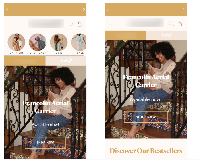
The Challenge: Heuristic analysis revealed that the cart drawer contained multiple CTAs with identical visual hierarchy:
- "Checkout" button (primary action)
- "View Cart" button (secondary action)
Both CTAs appeared as equally prominent buttons with similar styling, creating a "which one should I click?" moment for users.
The Behavioral Issue:
- Decision paralysis: Users wasted time deciding between options
- Cognitive load: Instead of moving forward, users processed which action to take
- Friction point: The moment of highest purchase intent became a moment of hesitation
- Confusion: Users weren't sure if "View Cart" or "Checkout" was the recommended next step
The Core Question: Should we reduce decision points at this critical moment in the purchase journey? And if so, which action should we prioritize?
🧪 The Hypothesis
"If we reduce the visual hierarchy confusion by making 'Checkout' the primary CTA and demoting 'View Cart' to a hyperlink (or removing it entirely), we can reduce decision paralysis and increase conversion rates."
Psychological Principles:
- Choice Architecture: Fewer equally weighted options reduce decision fatigue
- Visual Hierarchy: Clear primary action guides user behavior
- Cognitive Load Theory: Reducing mental processing increases action rates
- Progress Principle: Users prefer moving forward rather than backtracking
🔬 The Experiment
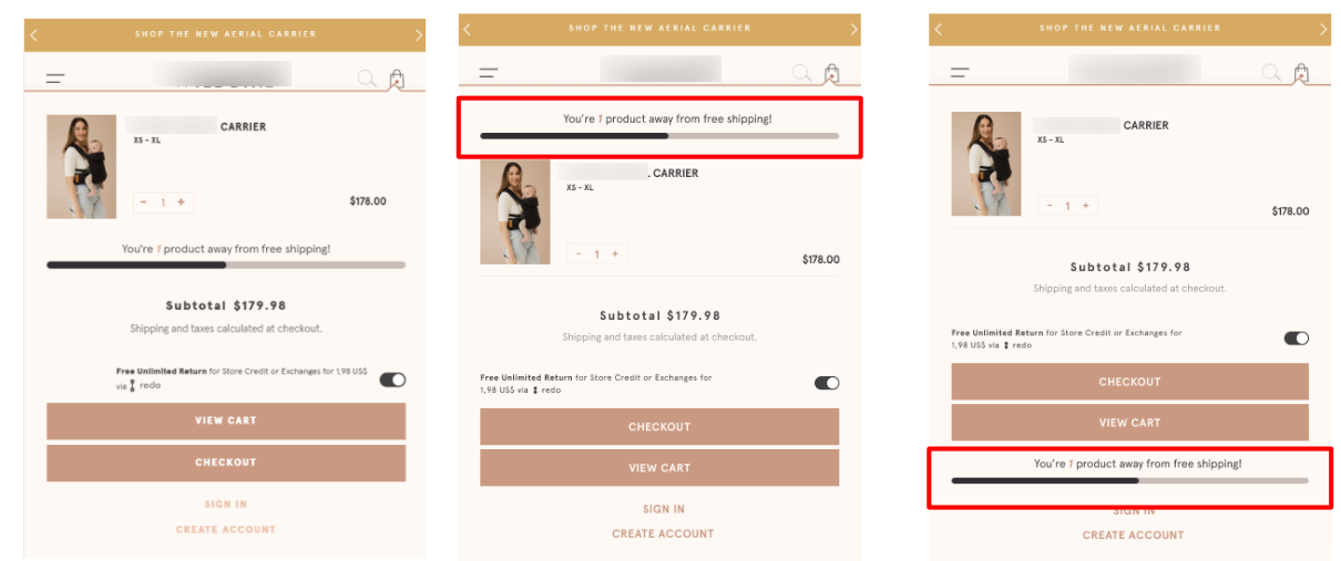
We tested two variations of the cart drawer after adding a product to cart:
Control:
- Two equally prominent CTAs: "Checkout" and "View Cart" (both as buttons)
- Equal visual weight and styling
- Users must decide between two primary actions
Variation 1: Hierarchy Fix
- "Checkout" as primary CTA (prominent button)
- "View Cart" as secondary CTA (text hyperlink)
- Clear visual distinction between primary and secondary actions
Variation 2: Single CTA
- Only "Checkout" as CTA (prominent button)
- "View Cart" removed entirely
- Clicking "Checkout" redirects directly to checkout
Trigger: Both variations only appeared after users added a product to cart (not on pageview)
📈 The Results
The Paradox: More Clicks, Fewer Sales
All Users: +80.84% Click checkout cart drawer,-1.31% Purchase Conversion Rate, -6.29% Revenue per Visitor
Mobile Users: +51.98% Click checkout cart drawer, +2.97% Purchase Conversion Rate, -6.06% Revenue per Visitor
Desktop Users: -6.13% Click checkout cart drawer, -6.13% Purchase Conversion Rate, -9.74% Revenue per Visitor
The Fascinating Pattern:
- Click-through rates increased dramatically (+80.84% for all users)
- But conversion rates and revenue decreased (-6.29% RPV for all users)
- Mobile users saw conversion rate increase (+2.97%)
- Desktop users saw significant declines (-6.13% conversion rate)
💡 The Critical Insight: Clicks ≠ Conversions
Why Clicks Increased But Revenue Decreased:
- The Click Trap: Users were clicking "Checkout" more often, but many of these clicks came from users who weren't ready to purchase. The visual hierarchy change made "Checkout" impossible to miss, but didn't address underlying purchase readiness.
- Mobile vs. Desktop Behavior:
- Mobile: Users are more impulsive, so the clearer CTA helped them convert
- Desktop: Users are more deliberate; the forced "Checkout" pushed unready users into the funnel
- The Readiness Gap: The test revealed that many users who clicked "Checkout" weren't ready to purchase. They either:
- Hadn't reviewed their cart
- Weren't ready to commit
- Were just testing the UI
- The Friction Shift: By making "Checkout" more prominent, we shifted friction from "which button should I click?" to "am I ready to buy?"—but many users weren't.
The Key Takeaway: More clicks don't always mean more sales. If the user isn't ready to purchase, forcing them into the checkout flow creates premature friction that decreases revenue.
🎯 What This Means for Your Store
1. Don't Optimize for Clicks Alone: This test proves that increasing CTA clicks doesn't necessarily increase revenue. Always track revenue per visitor, not just click rates.
2. Consider User Readiness: The most important question isn't "What should the CTA say?" but "Is the user ready to take this action?"
3. Mobile and Desktop Need Different Approaches: Mobile users responded positively to the hierarchy fix (+2.97% conversion), while desktop users declined (-6.13%). Test separately for each device.
4. Secondary Actions Have Value: "View Cart" served as a safety valve for users who needed to review their cart before committing. Removing this option created premature friction for unready users.
5. Friction Isn't Always Bad: Some friction (like reviewing your cart) is necessary and healthy. The problem was confusion—not the presence of multiple options.
6. Segment Your Data: If you only looked at the overall results (-6.29% RPV), you'd miss the mobile win (+2.97% conversion). Always segment by device!
🔧 The Solution: Strategic CTA Hierarchy
Based on these results, we recommend:
For Mobile:
- Implement Variation 1 (hierarchy fix)
- Make "Checkout" primary and "View Cart" a hyperlink
- Mobile users respond better to clear direction
For Desktop:
- Keep the control (two equally weighted CTAs)
- Desktop users need the "safety valve" of "View Cart" to review before committing
🎯 Key Takeaways
Clicks ≠ Conversions — More action doesn't always mean more revenue
User readiness matters — Don't force unready users into checkout
Mobile and desktop need different CTAs — Test separately for each device
Secondary actions have value — "View Cart" is a safety valve for unready users
Friction can be healthy — Some hesitation is necessary for purchase confidence
Revenue per visitor is king — Always optimize for this metric
When to Simplify CTAs
Simplify If:
- Your "View Cart" CTA is rarely used
- Users are abandoning because they're confused by options
- You have high bounce rates from cart to checkout
- Mobile traffic is >70% of your traffic
Keep Multiple CTAs If:
- "View Cart" is a critical step in your purchase journey
- Users need to review their cart before committing
- Desktop traffic is significant (>30% of traffic)
- Your checkout funnel is already optimized
The Results
The Results
increase in Conversion Rate (Mobile)
decrease in Revenue Per Visitor (All Traffic)
increase in Click Checkout CTA
More A/B Tests
Contact us
Lorem ipsum dolor sit amet, consectetur
Lorem ipsum dolor sit amet, consectetur adipiscing elit. Suspendisse varius enim in eros elementum tristique.
Lorem ipsum dolor sit amet, consectetur adipiscing elit. Suspendisse varius enim in eros elementum tristique. Duis cursus, mi quis viverra ornare.
Lorem ipsum dolor sit amet, consectetur adipiscing elit. Suspendisse varius enim in eros elementum tristique. Duis cursus, mi quis viverra ornare.
Lorem ipsum dolor sit amet, consectetur adipiscing elit. Suspendisse varius enim in eros elementum tristique. Duis cursus, mi quis viverra ornare.