Moving ShopPay Above the Fold Increased Mobile Conversions by 11.95% in Under 2 Weeks
The Visibility Gap at Critical Moments
When users evaluate a product and see the price, they enter a critical decision window. In these moments, every piece of information that reduces purchase anxiety matters. Payment flexibility options like "Buy Now, Pay Later" (BNPL) services can significantly reduce price resistance—but only if users see them.
The universal challenge: Critical conversion elements positioned below the fold are effectively invisible to users who don't scroll. When payment options that reduce anxiety are hidden, brands lose conversions from users who would have purchased if they'd seen the solution to their price concern.
This test reveals how strategic repositioning of existing content—without adding new features or changing messaging—can dramatically impact conversion rates, especially on mobile devices where scroll behavior differs significantly from desktop.
The Challenge: ShopPay (a "Buy Now, Pay Later" payment option offering interest-free installments) was positioned below the fold on the product page, requiring users to scroll to see it.
The Behavioral Issue:
- Price anxiety moment: Users saw the price ($178.00) but didn't immediately see the payment flexibility option
- Scroll debt: Critical information that reduces purchase friction was hidden below visible screen area
- Mobile impact: On smaller screens, users had to scroll significantly to find payment options
- Lost opportunity: Users experiencing price hesitation couldn't see the solution (interest-free installments) at the critical decision moment
The Core Question: If we move ShopPay directly under the price (above the fold), will users see it at the moment of purchase anxiety and convert at higher rates?
🧪 The Hypothesis
"If we position ShopPay directly under the price (above the fold), we can reduce purchase anxiety at the critical decision moment, making payment flexibility immediately visible and increasing conversion rates."
Psychological Principles:
- Above-the-Fold Primacy: Information seen immediately shapes purchase decisions
- Anxiety Reduction: Payment flexibility options reduce price resistance when shown at the price point
- Cognitive Load: Users shouldn't have to search for information that reduces purchase friction
- Mobile-First Behavior: Mobile users scroll less and need critical information visible immediately
The Experiment
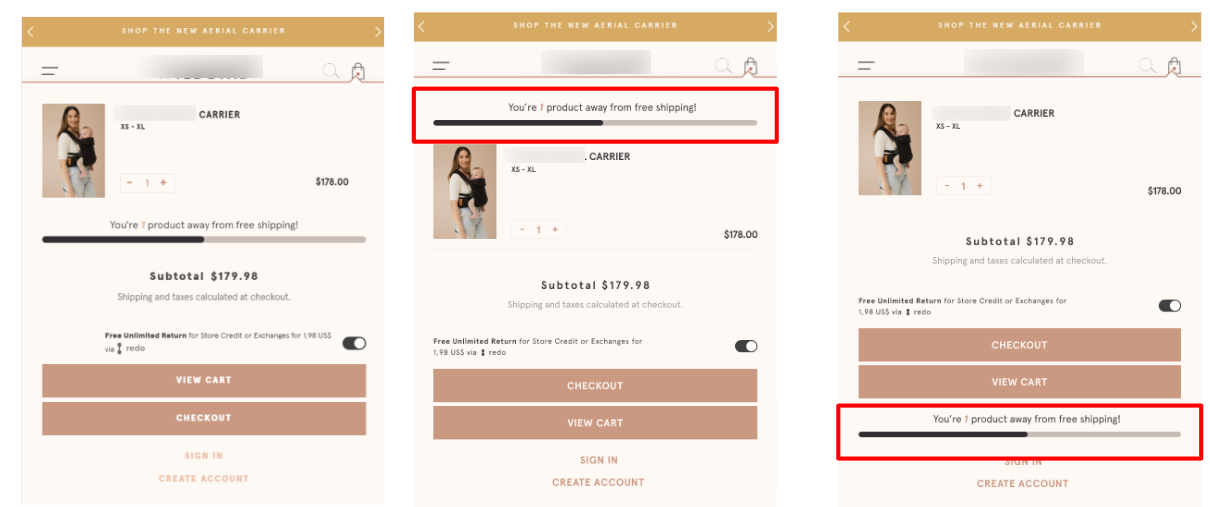
Control:
- ShopPay positioned below the fold (below "Add to Cart" button)
- Users had to scroll to see payment flexibility option
- Visual flow: Price → Add to Cart → Scroll → ShopPay
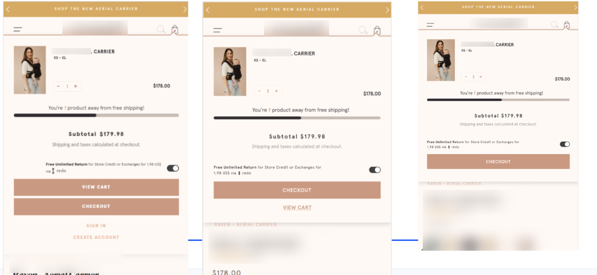
Variant 1: Move ShopPay Under Price
- ShopPay positioned directly under the price (above the fold)
- Payment flexibility visible immediately when users see the price
- Visual flow: Price → ShopPay → Add to Cart
- Mobile: Test triggers on scroll
- Desktop: Test triggers on pageview
The Strategic Change: Moving ShopPay from a hidden position to directly under the price ensures users see the payment flexibility option at the exact moment they experience price anxiety—before they decide whether to add to cart.
📈 The Results
Winner: Variant 1 (ShopPay Under Price)
Overall Performance:
- +4.62% Add to Cart PDP
- +9.84% Purchase Conversion Rate
- +8.58% Revenue per Visitor
Mobile vs. Desktop:
Mobile Users:
- +4.75% Add to Cart PDP
- +11.95% Purchase Conversion Rate
- +10.58% Revenue per Visitor
Desktop Users:
- Smaller but positive lifts across all metrics
- Mobile response was significantly stronger
Statistical Confidence: 87% probability of outperforming control
Test Duration: Less than 2 weeks (fast results due to strong signal)
💡 What This Means for Your Store
1. Payment Visibility > Payment Variety: You don't need more payment options—you need to make existing payment options visible at the right moment. ShopPay was already available; it just wasn't seen.
2. Above-the-Fold Placement Matters Most on Mobile: Mobile users showed a +11.95% conversion lift compared to smaller desktop gains. Mobile users scroll less and need critical information visible immediately. If your mobile traffic is >60%, this is crucial.
3. Reduce Anxiety at the Price Point: The moment users see the price is when purchase anxiety peaks. Showing payment flexibility (interest-free installments) at that exact moment reduces friction and prevents abandonment.
4. Add to Cart and Conversion Both Increased: This pattern shows the change reduced friction at multiple points in the funnel: more users added to cart (+4.62%), and more of those users completed purchase (+9.84%).
5. Positioning Beats Redesign: No new features, no design overhaul, no development sprint—just moving existing content 6 inches higher. Sometimes the biggest wins come from the simplest changes.
🎯 Key Takeaways
Payment options must be visible at price point — Don't hide them below the fold
Mobile responds stronger to above-the-fold optimization — +11.95% proves this
Reduce anxiety when it peaks — Show solutions at the moment of concern
Positioning > variety — Make what you have visible before adding more
Simple changes, big impact — Repositioning beats redesigning
📱 Implementation Notes
Technical Details:
- Move ShopPay widget directly under price (above fold)
- Ensure it's visible without scrolling on mobile
- Test trigger: Scroll for mobile, pageview for desktop
- Maintain clear visual hierarchy: Price → ShopPay → Add to Cart
When to Use This Pattern
Best For:
- Stores offering BNPL (Buy Now, Pay Later) options
- High-ticket products where price anxiety is significant
- Mobile-heavy traffic (>60% mobile)
- Product pages with payment options hidden below the fold
- Stores with good traffic but lower-than-expected conversion rates
The Results
The Results
increase in Conversion Rate
increase in Revenue Per Visitor
increase in Add to Cart
More A/B Tests
Contact us
Lorem ipsum dolor sit amet, consectetur
Lorem ipsum dolor sit amet, consectetur adipiscing elit. Suspendisse varius enim in eros elementum tristique.
Lorem ipsum dolor sit amet, consectetur adipiscing elit. Suspendisse varius enim in eros elementum tristique. Duis cursus, mi quis viverra ornare.
Lorem ipsum dolor sit amet, consectetur adipiscing elit. Suspendisse varius enim in eros elementum tristique. Duis cursus, mi quis viverra ornare.
Lorem ipsum dolor sit amet, consectetur adipiscing elit. Suspendisse varius enim in eros elementum tristique. Duis cursus, mi quis viverra ornare.