How Organizing Color Swatches Increased Conversions by 16.98%
Choice Paralysis from Too Many Options
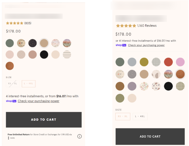
The Challenge: A baby set product offered extensive color options — solid colors, prints, and special editions—all displayed as a single grid of swatches. Users faced:
- Overwhelming visual complexity from 20+ swatch options
- Decision paralysis from undifferentiated choices
- Slower decision-making as they scrolled through all options
- Anxiety about whether they were making the right choice
The Behavioral Issue: When presented with too many options without clear categorization, users experience:
- Cognitive overload — too much information to process
- Analysis paralysis — fear of making the wrong choice
- Decision fatigue — mental exhaustion from evaluating options
- Abandonment — "I'll just buy from somewhere simpler"
The Insight: Not all options are created equal. By organizing swatches into meaningful categories (Core vs. Seasonal), we can help users self-select based on their preferences and reduce the mental effort required to choose.
🧪 Hypothesis
"If we separate color swatches into two distinct categories—Core (solid colors) and Seasonal (prints)—and allow users to toggle between them, we can reduce cognitive load and decision paralysis—leading to faster, more confident purchases."
Psychological Principles:
- Choice Architecture: Organizing options helps users navigate complexity
- Hick's Law: More choices = longer decision time. Categorization reduces perceived options
- Progressive Disclosure: Show only relevant options based on user selection
- Mental Models: Users think in categories (basics vs. limited editions)—match their thinking
🔬 Experiment
We Tested Two Approaches:
Variant 1: Labels
- Reduced size of color swatches
- Organized swatches into two categories with labels:
- Core: For solid colors
- Seasonal: For prints
- All swatches still visible on page
Variant 2: Tabs (Winner)
- Implemented toggle tabs allowing users to select between:
- All (show everything)
- Core (solid colors only)
- Seasonal (prints only)
- Special Edition (limited runs)
- Swatches update dynamically based on selected tab
- Reduced swatch size for cleaner presentation
Why Tabs Won:
Labels (V1) still showed all options at once—reducing size but not complexity.
Tabs (V2) actively hide irrelevant options, forcing users to make a category choice first, then a color choice.
This two-step process:
- Reduced initial cognitive load
- Created clearer mental separation
- Made decision-making feel manageable
📈 Results
Winner: Variant 2 (Tabs)
Primary Metrics:
- +16.98% Purchase Conversion Rate
- +10.53% Revenue Per Visitor
- -4.44% Add to Cart Rate
The Pattern: Add-to-cart decreased but conversion rate and revenue increased significantly—proving this change qualified buyers and reduced decision paralysis.
Statistical Confidence: 98% probability of outperforming control
Note: Variant 1 (Labels) was stopped early due to poor performance
💡 What This Means for Your Store
1. Too Many Choices Can Kill Sales: If you offer extensive variants (colors, sizes, styles), showing them all at once creates paralysis. Organize them meaningfully.
2. Categorization Beats Compression: Simply making swatches smaller (V1) didn't work. Actively hiding irrelevant options (V2) did. Progressive disclosure is key.
3. Two-Step Decisions Are Easier: Step 1: Choose category (Core vs. Seasonal) Step 2: Choose specific option. This feels easier than evaluating 20+ options simultaneously.
4. Match Your Customers' Mental Models: Customers naturally think: "Do I want a basic solid color or a fun print?"—structure your interface around their thinking, not your inventory system.
5. Fewer Add-to-Carts Can Mean Better Conversions: The -4.44% ATC rate shows users were more deliberate in their choices. They spent more time selecting, but converted at much higher rates. Quality over quantity.
6. Test Multiple Variations: V1 failed spectacularly (-37.66% RPV). V2 won big (+10.53% RPV). Without testing both, we might have implemented a losing change or missed the winning pattern.
🎯 Key Takeaways
- Choice architecture matters — How you present options is as important as the options themselves
- Progressive disclosure reduces cognitive load — Hide complexity until needed
- Tabs > Labels for extensive options — Active filtering beats passive categorization
- Match mental models — Organize how customers think, not how you store data
- Qualifying decisions increases conversion — Deliberate choices = higher confidence
- Test multiple approaches — V1 failed, V2 won—testing revealed the right solution
🛠️ Implementation Notes
Technical Details:
- Tab-based navigation with dynamic swatch updates
- Mobile: Experiment triggers on scroll (non-intrusive)
- Desktop: Experiment triggers on pageview (immediate visibility)
- Reduced swatch size for cleaner presentation
- Smooth transitions between tabs
When to Use This Pattern
Best For:
- Products with 10+ variant options
- Color swatches, size options, style variations
- Stores with high bounce rates on PDPs
- Mobile-heavy audiences (smaller screens = more overwhelm)
Considerations:
- Categories must be meaningful to customers (not just inventory logic)
- Don't create too many tabs (3-5 max)
- Ensure default view shows most popular or all options
- Test tab labels for clarity

The Results
The Results
increase in Purchase Conversion Rate
increase in Revenue Per Visitor
decrease in Add to Cart Rate
More A/B Tests
Contact us
Lorem ipsum dolor sit amet, consectetur
Lorem ipsum dolor sit amet, consectetur adipiscing elit. Suspendisse varius enim in eros elementum tristique.
Lorem ipsum dolor sit amet, consectetur adipiscing elit. Suspendisse varius enim in eros elementum tristique. Duis cursus, mi quis viverra ornare.
Lorem ipsum dolor sit amet, consectetur adipiscing elit. Suspendisse varius enim in eros elementum tristique. Duis cursus, mi quis viverra ornare.
Lorem ipsum dolor sit amet, consectetur adipiscing elit. Suspendisse varius enim in eros elementum tristique. Duis cursus, mi quis viverra ornare.